copyright.
developed by IWAI Masayuki / designed by KANEDA Shinya
Press Kit
Members of the press,
We have prepared PR materials relating to months for your use.
We encourage you to use these materials when introducing months in your articles and reports.
No prior permission is required to use these materials.
We also leave the method and content of introducing the app to your discretion.
We hope that more people will be able to learn about months.
If you have any questions or require further information, please do not hesitate to contact us. Additional materials are available upon request.
We sincerely look forward to working with you.
Basic information
- App name: months
- AppStore link:https://apps.apple.com/us/app/id6739420415
- Price:USD$0.99/$9.99
- Developer: developed by IWAI Masayuki / Designed by KANEDA Shinya
- Contact: info@months.jp
Logo
The logo for the calendar app, months, is designed around colorful elements reminiscent of the categories that appear at the beginning of each calendar appointment, and these elements form the shape of the first letter “m” in the app's name.
Each element represents a calendar function or appointment category. For example, red represents important appointments, blue represents work-related appointments, and green represents personal appointments, making it easy to distinguish appointment type by color.
The simple, colorful design suggests that the app is intuitive and easy to use, which is effective in appealing to users of all ages. The logo's bright and lively colors reflect the app's intention to make schedule management fun.
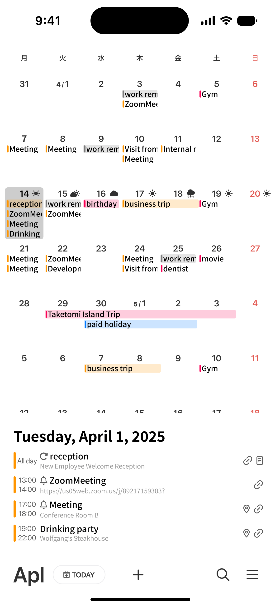
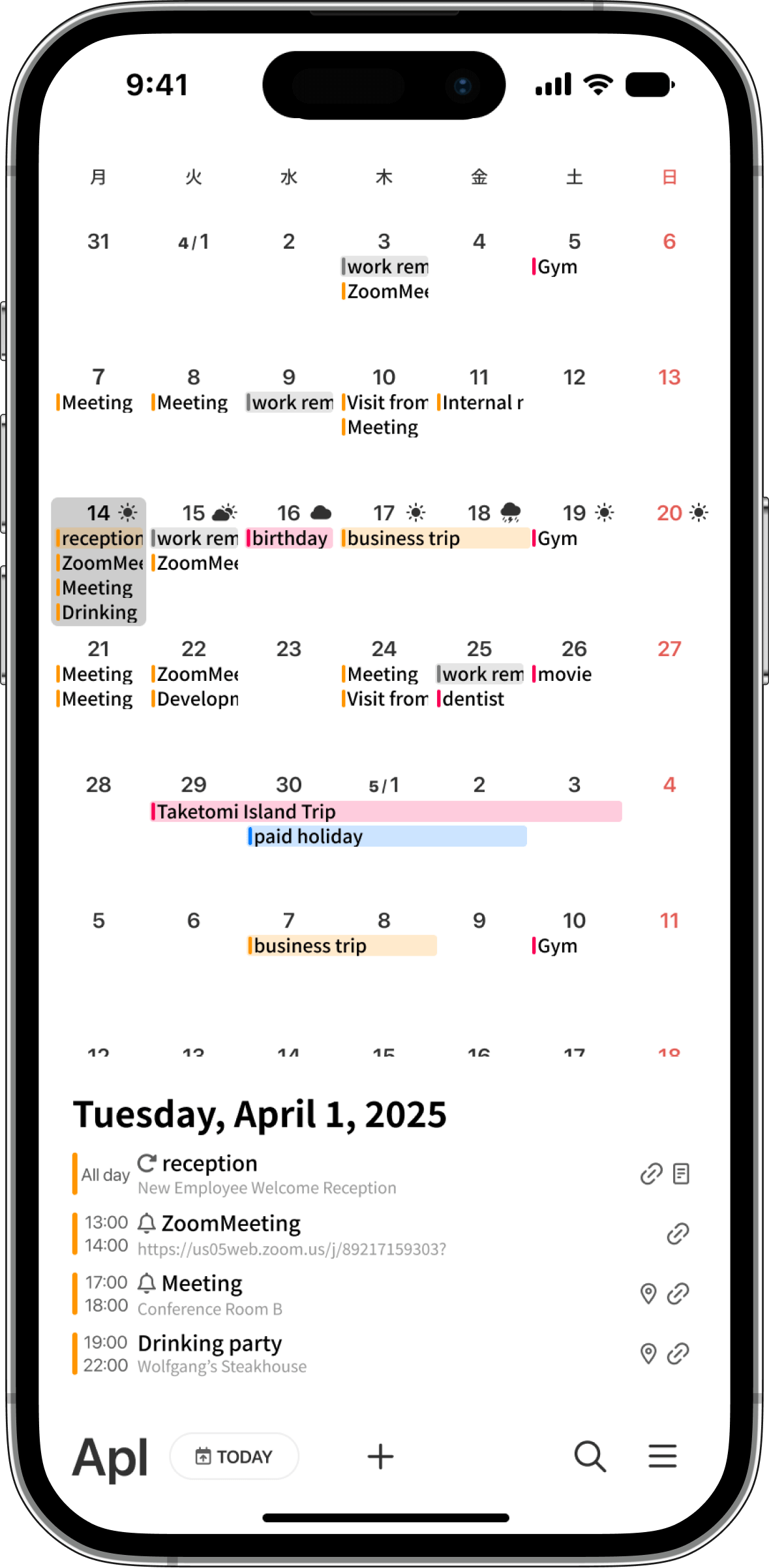
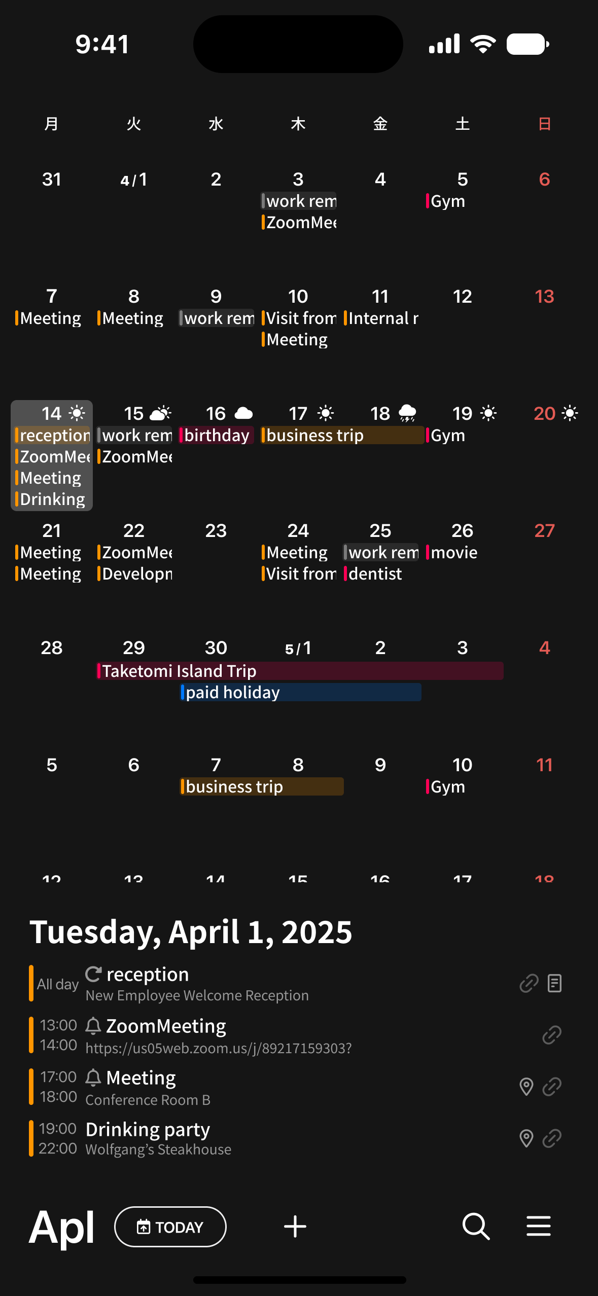
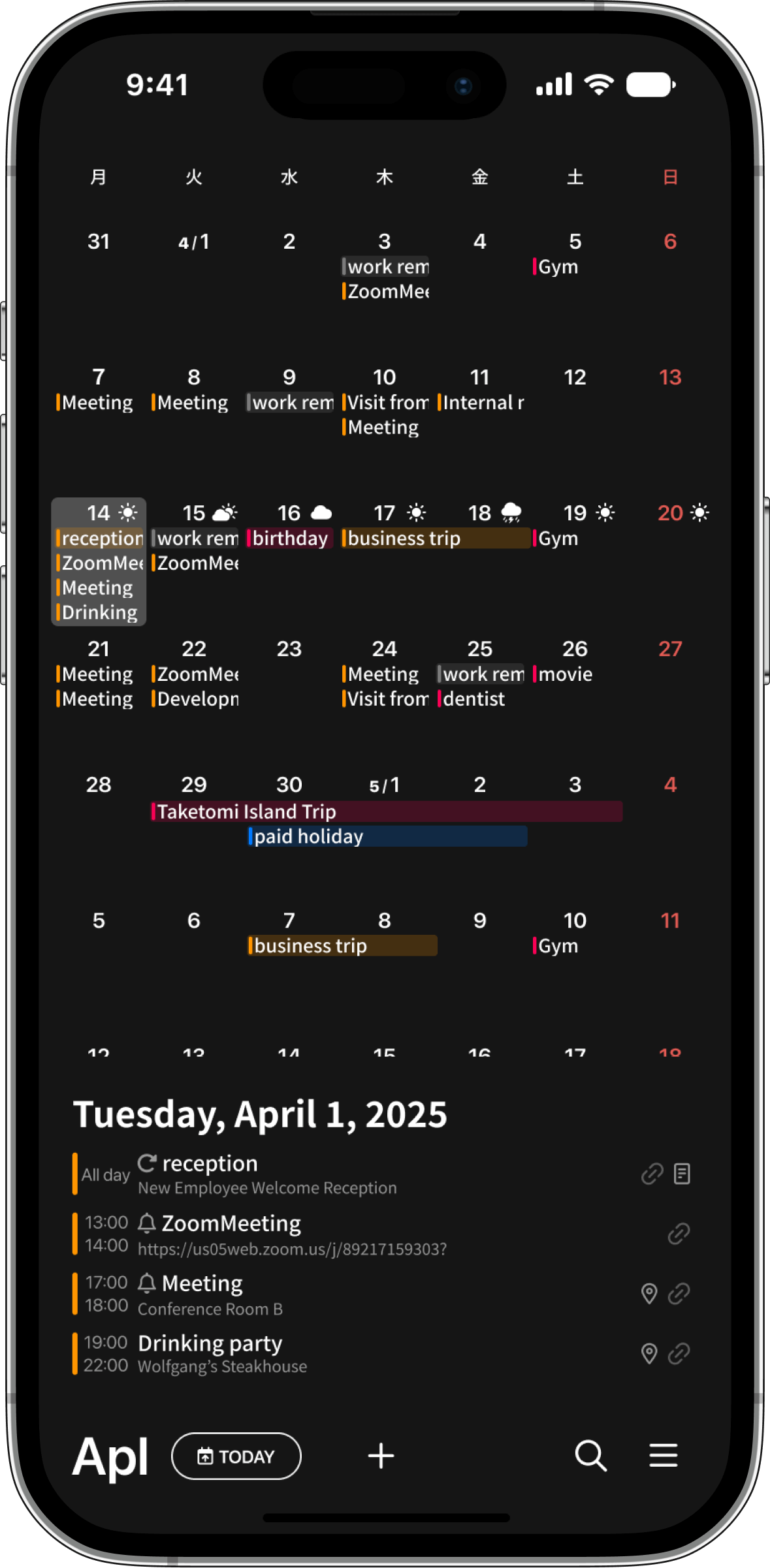
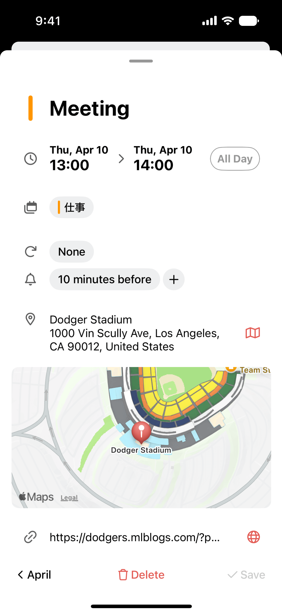
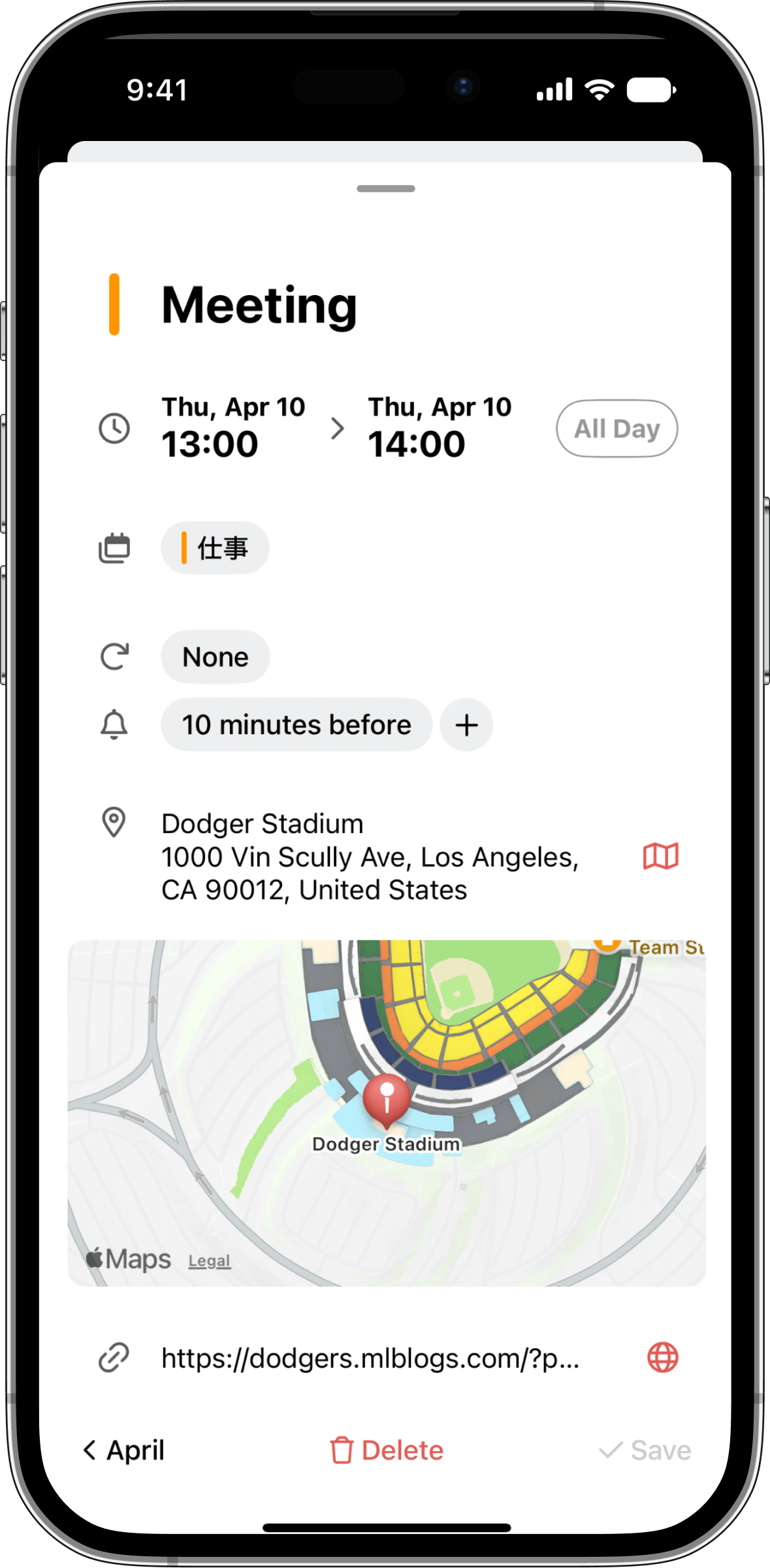
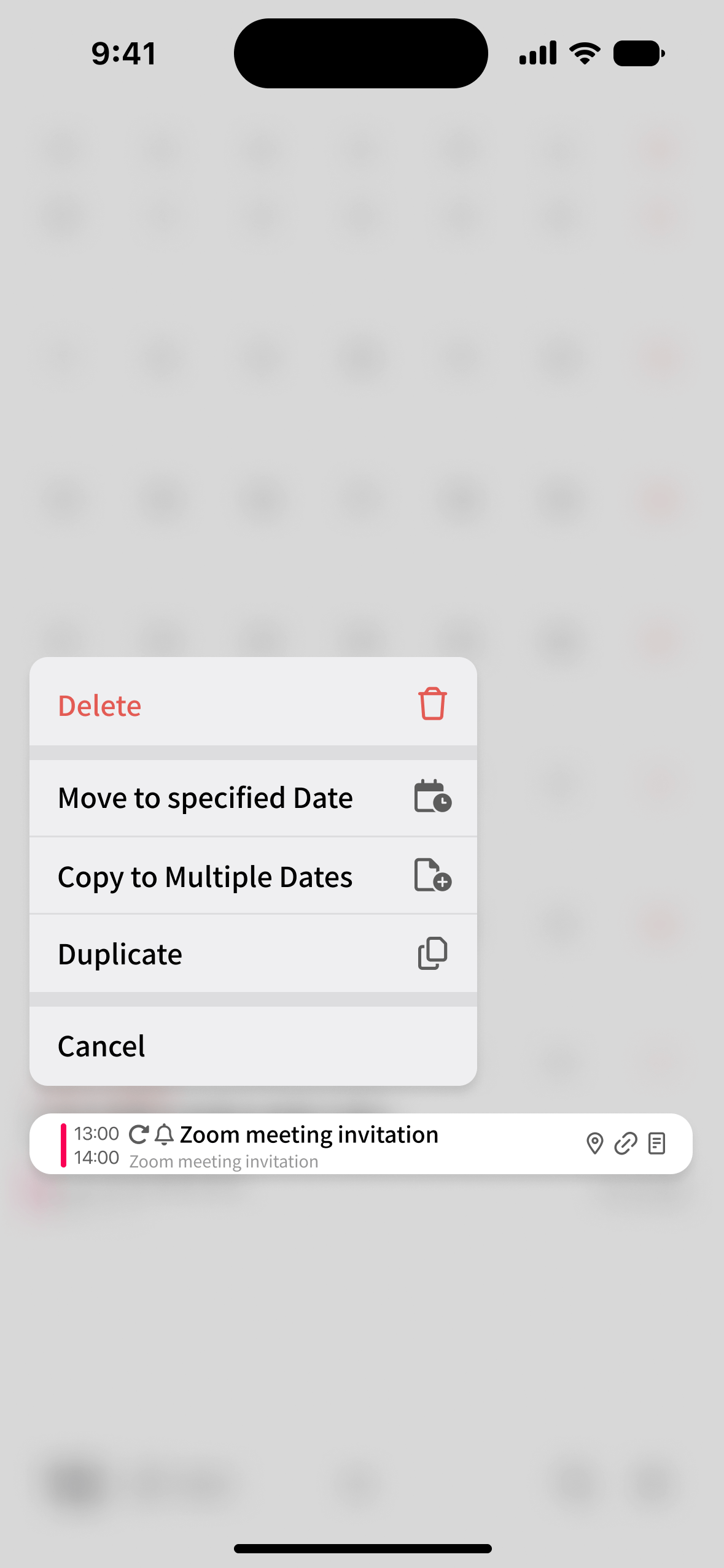
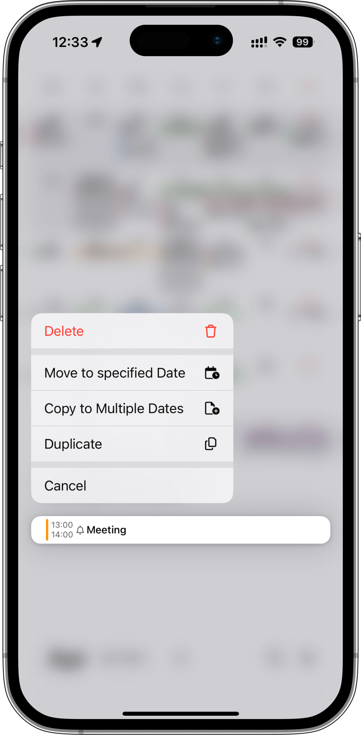
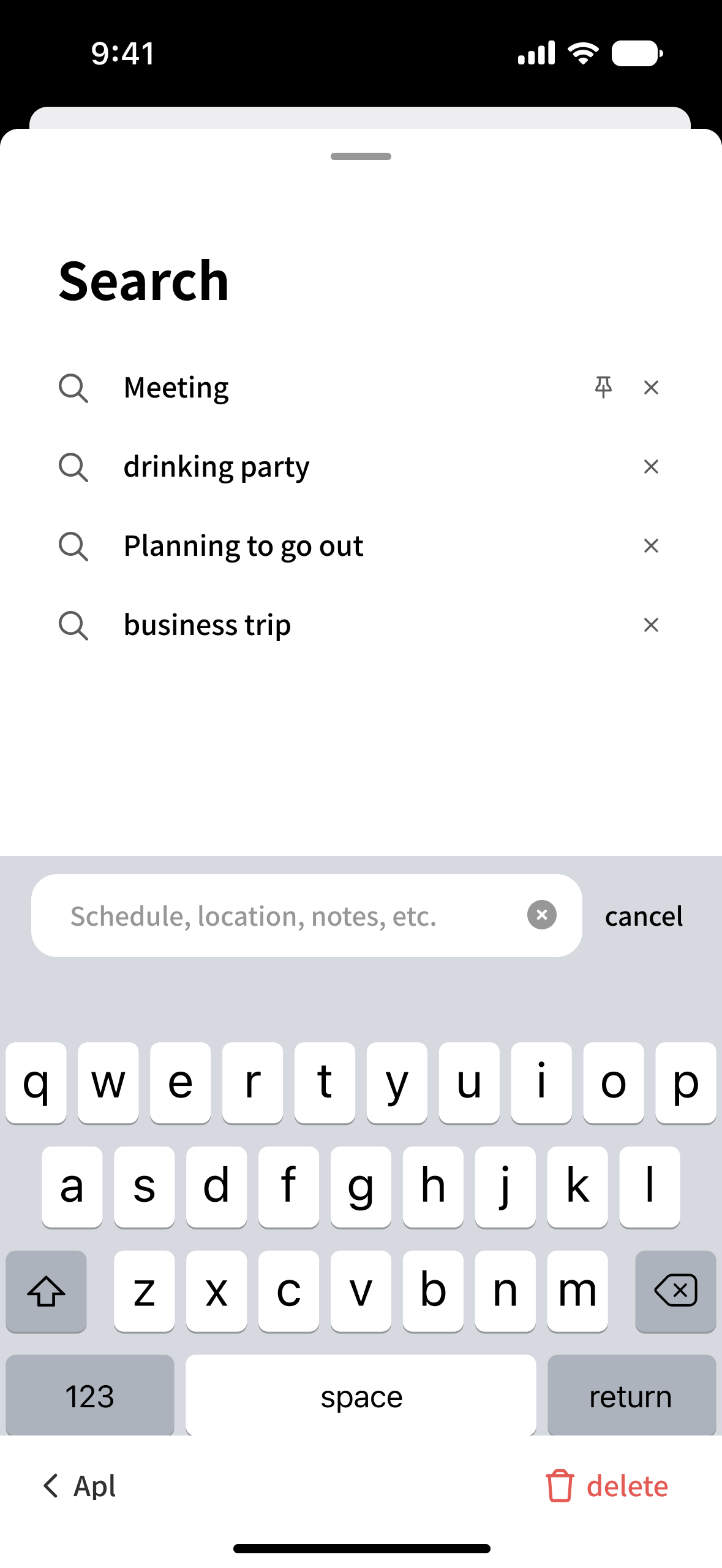
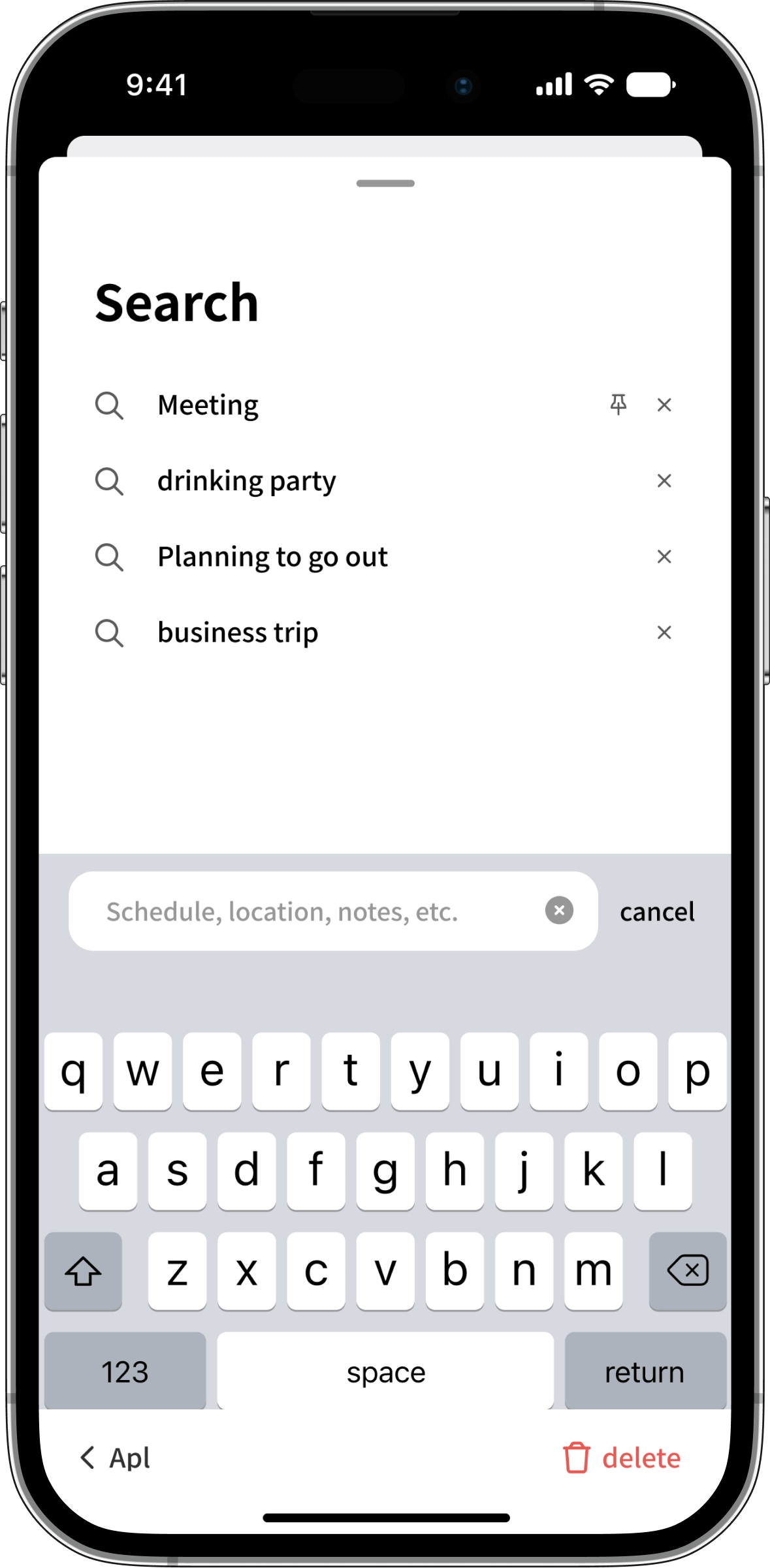
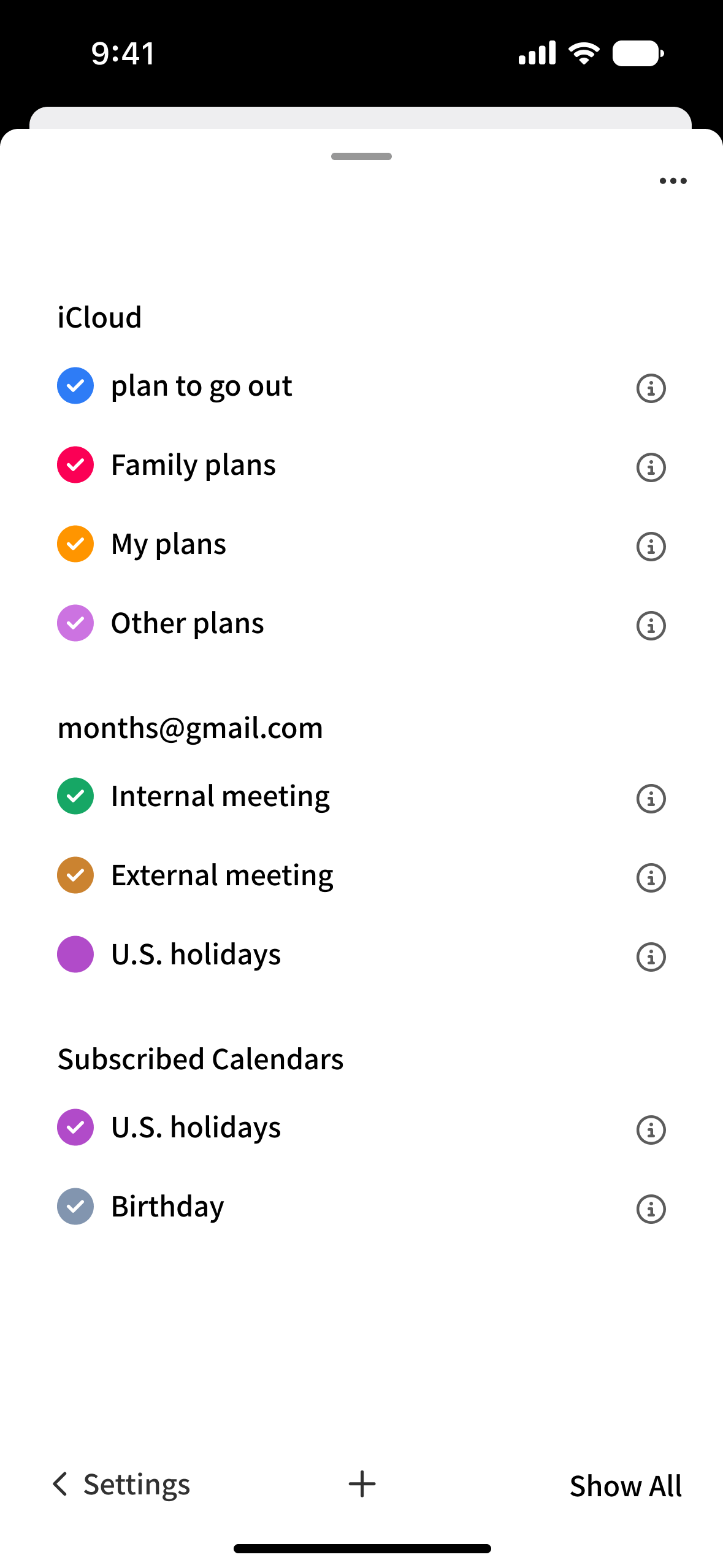
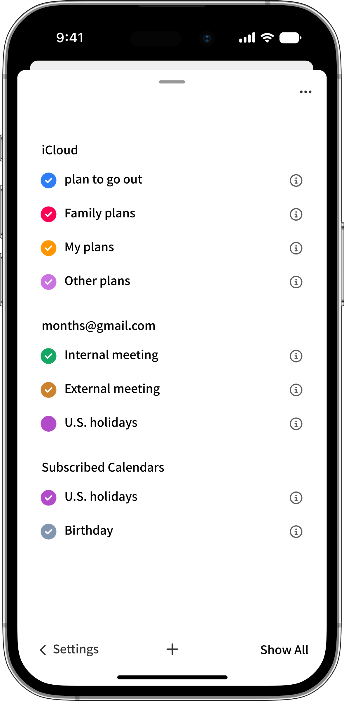
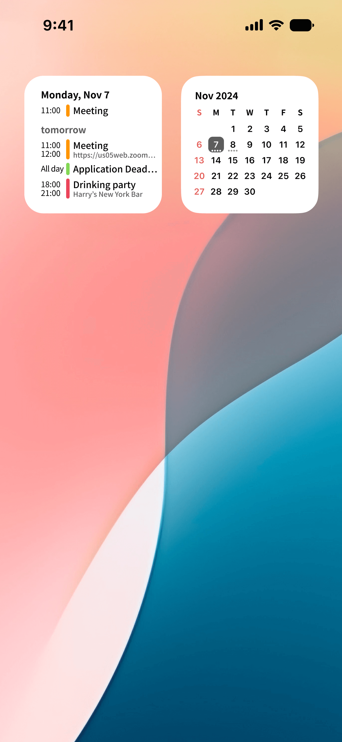
Screenshots