Now that the iPhone is deeply woven into our daily lives, the comfort of a user interface (UI) is no longer just a matter of design—it directly affects everyday “ease of use” and “stress reduction.” Among the many considerations, the “thumb zone map,” which focuses on how the thumb moves and how far it can reach during one-handed use, is extremely important in UI design.
What Is the “Natural Movement” of the Thumb During One-Handed Use?
When you hold an iPhone in one hand, the typical pattern is to support it with your index and little fingers while operating it with the thumb alone. In this position, the thumb naturally moves in an “arc.” In other words, rather than swiping straight up-and-down or side-to-side, the thumb is better suited to curved, diagonal motions—especially curves running from the lower portion of the screen toward the center.
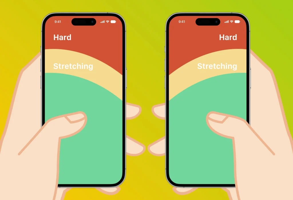
Based on this movement pattern, the screen can be divided into three areas: an “easy-to-reach zone,” a “zone that requires some effort,” and a “hard-to-reach zone.” Much like a heat map, this “thumb zone map” lets you quantitatively gauge how comfortable actions such as tapping and swiping will be.
Thinking in Terms of a 6.3-Inch Screen
Assuming one-handed use of a typical smartphone (for example, an iPhone of around 6.3 inches), the area from the bottom of the screen up to slightly below the center is the “most comfortably accessible zone.”
- Place action buttons and navigation at the bottom
- Make top menus accessible via scrolling or gestures
- Less important elements can be placed in the “effort zone”
The UI Design of “months“
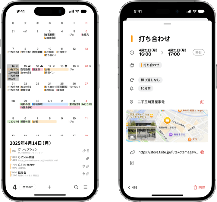
“months” was actually designed with this thumb zone map in mind. Built around one-handed use, action buttons—such as navigating the calendar and adding events—are placed within the “easy-to-reach zone” to support smooth operation. The finer interaction design is also tailored to the natural movement of the thumb, so that actions can be completed within the “zone that requires some effort.”
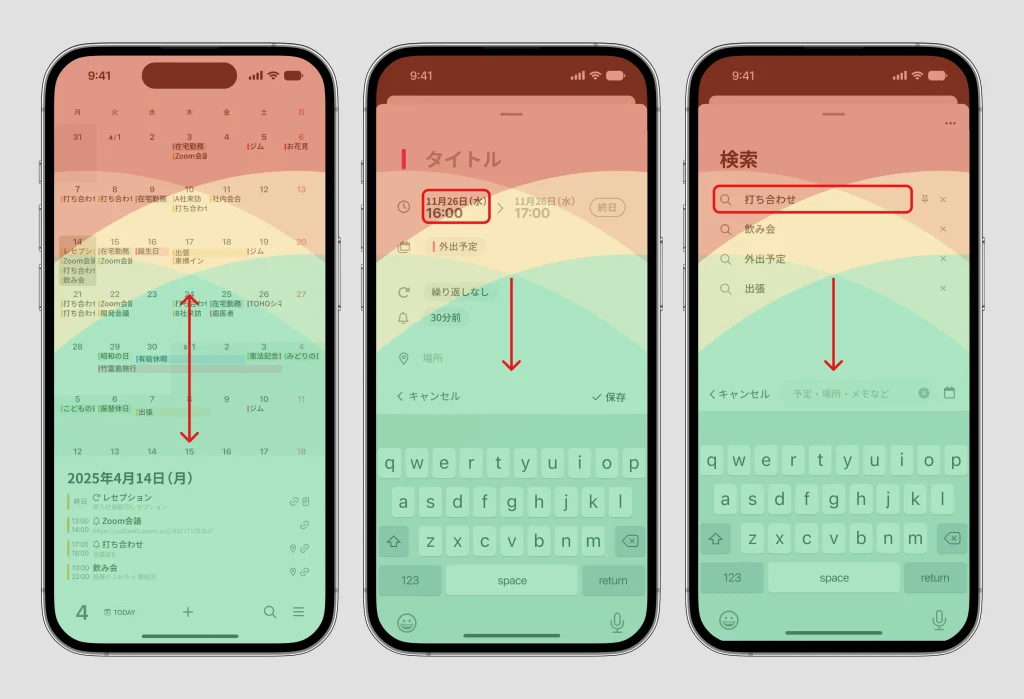
Screens such as the event detail screen (the add-event screen) and the search screen have a tap area for “closing the screen” (the long horizontal line at the top of the screen) in a hard-to-reach area, but the same action can also be performed by flicking the screen downward. Even for items positioned where the finger has trouble reaching, the tap areas are made as large as possible to keep operation easy.
Finally: Don’t Forget Individual Differences
Of course, the thumb zone map is only a “general guideline.” Ease of use varies with many factors—hand size, whether you are right- or left-handed, your phone model, the thickness of your case, and more. An optimized UI, therefore, should not be a one-size-fits-all answer; it should be designed with a focus on feeling “naturally usable” to as many people as possible.