This logo was designed to visually embody the brand identity of the calendar app “months,” resulting in a design that combines functionality with approachability. Focusing on the “color coding” and “visibility” that define the calendar experience, the logo conveys an intuitive, easy-to-use impression while graphically expressing “m,” the first letter of the app name “months,” to create a strong brand association.
1. Motif and Design Elements
The logo is made up of two main visual elements.
- Color bars coded by type of event
- The overlapping color bars that form the “m”
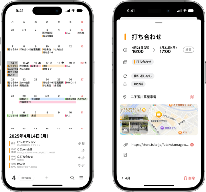
In the calendar, the bars are color-coded by type of event, so you can see at a glance what kind of events you have. The different colors make it instantly clear that you have a variety of schedules, such as work and personal life.
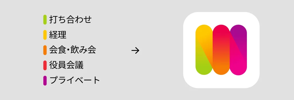
In this logo, these color bars overlap one another to form an “m.” This form not only symbolizes the first letter of “months,” but also expresses how the elements overlap in harmony, reflecting the app’s functional strength of integrating and managing multiple aspects of life in one place.
2. Color Palette and Meaning
The five colors used (green, yellow, orange, red, and purple) were each chosen with an awareness of the different emotions and uses they evoke.
- Green (reassurance and harmony): everyday events, habits, and the like
- Yellow (attention and energy): important deadlines and reminders
- Orange (friendliness and action): plans with others and activities
- Red (urgency and emphasis): deadlines, important meetings, health matters, and so on
- Purple (creativity and individuality): hobbies, self-investment, and special days
By connecting these colors as a gradient within the logo, it emphasizes the integration and at-a-glance overview that the app offers in “bringing all your events together in one place.” The vivid, pop look also creates a sense of fun and familiarity that makes you want to use it every day.
3. Connection to the Brand Message
The app name “months” carries not only the meaning of “viewing your plans across multiple months,” but also the message of “adding more color and richness to each of your months.” This logo embodies exactly that concept, visually supporting you in grasping your daily events organized by color across any number of months without being constrained by monthly boundaries, managing them accurately, and making them more fulfilling.
Classify, integrate, and enjoy your events. By weaving these three values into the structure, colors, and form of the logo, months expresses its presence as something more than just a calendar app, namely a “life partner” that supports your everyday life.